
A strong headshot can be let down by the wrong background in seconds. You might be well dressed, well lit and giving a great expression, but if the setting feels distracting, dated or out of step with your industry, the image loses impact. That is why choosing the best backgrounds for headshots matters just as much as choosing the right outfit or photographer.
For most professionals, the goal is not to have a background that steals attention. It is to have one that supports the message of the portrait. You want people to notice your face first, then absorb the overall impression – credible, approachable, polished, confident. The background should help create that impression quietly.
What makes the best backgrounds for headshots?
The best backgrounds for headshots do three things well. They keep the focus on you, they suit the purpose of the image, and they feel current rather than forced.
That sounds simple, but there is always some context involved. A solicitor, actor, start-up founder and personal trainer do not all need the same look. A background that works brilliantly for LinkedIn may feel too plain for a personal brand shoot. Equally, a dramatic textured wall might suit a performer but feel too stylised for a finance director.
This is where good guidance makes a difference. Rather than asking, “What background looks nicest?”, a better question is, “What background helps me be seen in the right way?”
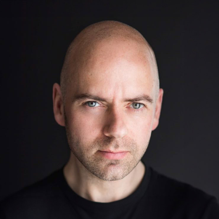
Plain studio backgrounds
A plain studio background is often the safest and strongest option for professional headshots. Grey, white, charcoal and soft neutral tones remain popular because they are clean, timeless and easy to use across different platforms.
Grey is especially versatile. It can look polished and modern without feeling stark, and it tends to flatter a wide range of skin tones, hair colours and clothing choices. It also works well for people who want to appear professional but not overly corporate. That balance is useful for consultants, team leaders, entrepreneurs and anyone updating a LinkedIn profile.
White backgrounds can look fresh and high key, but they are not always the best choice for everyone. If they are badly lit, they can appear harsh or cheap rather than premium. They can also reduce shape and depth in the portrait if the lighting is too flat. When handled properly, though, white can work well for modern brands, creative businesses and website imagery that needs a bright, clean feel.
Dark backgrounds can look refined and confident. They often suit senior professionals, speakers, authors and performers because they add depth and a little more presence to the portrait. The trade-off is that darker setups need careful lighting and wardrobe coordination. If everything is dark, the image can become heavy.
Office and workplace backgrounds
A real workplace background can be excellent when it adds relevance without clutter. This approach is often useful for company websites, leadership profiles and personal branding images where context matters.
An office setting can suggest professionalism, scale and authenticity. A softly blurred boardroom, studio, clinic or reception area can help viewers place you in your working world. For some industries, that visual context builds trust quickly.
The key word here is softly blurred. If the background is too sharp, people start reading screens, noticing cables, or being distracted by coffee cups and ceiling tiles. None of that helps your first impression. A well-chosen workplace background should feel real but controlled.
This option also depends on the quality of the space itself. A modern, tidy office can elevate a portrait. A cramped or badly lit one can do the opposite. If the location does not support the image you want to project, a studio setup is often the stronger choice.
Outdoor backgrounds
Outdoor headshots can feel relaxed, natural and approachable. They often suit creatives, coaches, presenters and business owners who want a less formal image.
Natural light and environmental depth can create a very flattering result, especially with greenery, architectural textures or clean urban lines in the distance. The effect can feel more editorial and less corporate, which is ideal if that matches your brand.
But outdoor backgrounds are not automatically better because they seem informal. They come with compromises. Lighting changes quickly, weather is unpredictable, and busy public spaces can create distractions. Background colours may also clash with clothing or skin tone more easily than in a studio.
Outdoor shots work best when the location is chosen carefully and the overall brand message is clear. A city professional may suit a refined urban backdrop. A wellness coach may look more at home in softer natural surroundings. What matters is that the setting feels intentional.
Textured and coloured backgrounds
Textured or coloured backgrounds can give a headshot more character, but they need restraint. A subtle texture can add depth and richness without taking attention away from the face. This can be useful if you want the portrait to feel more premium or less generic.
Muted blues, warm neutrals, soft greens and earthy tones can work beautifully depending on skin tone, clothing and brand identity. Actors, authors, publicists and personal brands sometimes benefit from this style because it adds distinction while still keeping the image professional.
The risk is overdoing it. Strong colours, obvious patterns or trendy backdrops can date quickly. If the background becomes the most memorable thing in the image, it is probably too much. Most people need a headshot that will stay useful for several years, not something tied to a passing visual trend.
How your industry changes the right choice
There is no single answer to background choice because the image has a job to do. For corporate teams, a clean and consistent background usually works best. It helps everyone look aligned and professional across a company website or internal profile system.
For job seekers, simplicity is often the strongest route. Recruiters and hiring managers are not judging your choice of exposed brick wall. They are deciding whether you look credible, approachable and ready for the role.
For entrepreneurs and creatives, there is often more room for personality. A coach, designer or performer may want something with more warmth or atmosphere. Even then, the background should still support clarity. Personal brand does not mean visual chaos.
If you are unsure, it usually helps to think about where the image will be used most. LinkedIn, company websites, press features, speaker bios and casting profiles all have slightly different expectations. The best background is the one that meets your most important use case first.
Why simple usually wins
Many people assume they need a more interesting background to make the image interesting. In practice, expression, posture, lighting and connection do far more of that work.
A simple background gives your face space. It keeps the portrait clear at small sizes, which matters on LinkedIn and mobile screens. It also makes the image easier to crop in different ways for websites, social media and publications.
This is one reason guided studio sessions work so well for nervous clients. When the setting is controlled, you are not juggling too many variables at once. You can focus on expression, angles and body language rather than worrying about whether the background is helping or hurting the image.
Choosing a background with your clothing in mind
Background and clothing need to work together. If both are very dark, the portrait can lose separation. If both are very light, the image can feel washed out. Contrast helps, but it needs to be flattering rather than extreme.
This is also where colour temperature matters. Warm backgrounds can complement some skin tones beautifully, while cooler greys and blues may suit others better. There is no universal rule, which is why reviewing test frames during a session is so useful.
At Newcastle Headshots, this kind of choice is easier when you can see the images as you go. It takes the guesswork out and helps you make decisions based on what actually looks good, not what sounded good beforehand.
The background should fit the message
If you want to look authoritative, the background should not feel playful. If you want to come across as friendly and down to earth, the setting should not feel cold or severe. Good headshots feel consistent. Everything in the frame points in the same direction.
That does not mean the image needs to be bland. It means every choice should support the result. The strongest headshots usually have a quiet confidence about them. Nothing is trying too hard, and that is exactly why they work.
When in doubt, choose the background that makes you look clear, current and comfortable. People respond to confidence they can trust, and the right background helps that come through without saying a word.


