

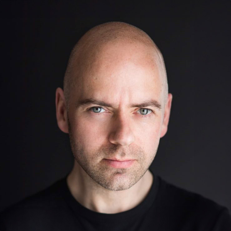
A backdrop can make a polished headshot feel current, credible and unmistakably yours – or make it look as though it belongs to someone else. Knowing how to choose a headshot backdrop is not about finding the most exciting wall or the trendiest colour. It is about making sure the background supports the impression you want to create before anyone reads your profile, CV or website.
For most people, that impression needs to be professional and approachable. For others, it may need to feel creative, authoritative, energetic or quietly premium. The right choice depends on your work, your audience and where the image will appear.
Start with the job your headshot needs to do
A LinkedIn profile photo, company team page portrait and actor headshot may all show the same person, but they are designed to achieve different things. Before choosing a backdrop, think about the message your photograph needs to send.
A solicitor, accountant or senior leader will often benefit from a clean, understated setting that keeps attention on their expression. A business owner or personal trainer might prefer something with a little more character, provided it still feels professional. Actors and performers may need a simpler background so casting teams can focus on their face without distraction.
Ask yourself: when a potential client, recruiter or colleague sees this image, what three words should come to mind? Perhaps capable, warm and trustworthy. Perhaps creative, confident and modern. Those words are a better starting point than copying a backdrop from someone else’s profile.
How to choose a headshot backdrop for your brand
Your backdrop should work with your personal brand, not compete with it. That does not mean every business headshot has to be photographed against plain grey. It means every choice should have a purpose.
A neutral studio backdrop is a strong option when you need flexibility. Soft grey, warm off-white, charcoal and muted tones tend to suit professional use because they look refined and remain useful across LinkedIn, company websites, speaker biographies and press features. They also allow your face, eyes and expression to lead the image.
A darker background can add authority, depth and a more editorial feel. It often works particularly well for senior professionals, consultants, creatives and anyone whose brand benefits from a confident, premium look. The trade-off is that clothing and lighting need careful consideration. A dark jacket against a dark backdrop can lose shape unless the photographer creates enough separation.
Lighter backgrounds usually feel open, fresh and accessible. They can be excellent for recruitment, healthcare, education, coaching and customer-facing businesses. However, bright white is not automatically the best choice. It can look stark if the lighting is too flat, and it may not suit every skin tone, outfit or website design.
Choose colour with care, not fear
Colour affects the mood of a portrait quickly. Blue-grey can feel calm and dependable. Earthy neutrals can feel warm and grounded. Deep green or navy may feel sophisticated. A subtle brand colour can add personality when it is used with restraint.
The safest approach is usually a background with a muted tone rather than a saturated block of colour. Strong red, vivid yellow or bright orange may grab attention, but they can overpower skin tones and become dated faster than you expect. They may also clash with the colours used on your company website or social media graphics.
This is where professional guidance makes a difference. The colour you see on a sample backdrop is only part of the decision. Lighting changes how it appears in camera, and your clothing, hair colour and complexion all affect the final balance. A backdrop that looks excellent for one person can be less flattering for another.
If your organisation has strict brand colours, you do not have to place everyone against the exact shade from the logo. A complementary tone often produces a more natural, flattering result while still sitting comfortably alongside the brand.
Consider where the photo will be used
Most headshots are viewed very small. On LinkedIn, Microsoft Teams or a company directory, your face might be no larger than a thumbnail. Fine background details disappear, but clutter and strong contrast still register.
That is why a simple backdrop is often the most effective choice for professional headshots. It keeps the image clear at every size and gives design teams room to crop the photograph for different formats. If you are using your portrait on a website banner, a media kit or promotional graphics, the photographer may also need to leave space on one side for text.
Think beyond one platform. A backdrop that feels suitable for an informal social post may not carry the same credibility on a corporate website. Conversely, a highly formal backdrop can feel slightly distant if you run a friendly, personality-led business. The best option has enough versatility to serve your main uses without diluting your identity.
Studio backdrops versus environmental headshots
A studio backdrop gives you control. The lighting is consistent, the visual distractions are removed and the attention stays where it should: on you. It is an excellent choice for teams who need a cohesive set of portraits, people refreshing LinkedIn profiles, and anyone who feels more comfortable with a calm, guided setup.
An environmental backdrop uses a real location, such as an office, workspace or outdoor setting. It can add context and personality, particularly for architects, hospitality professionals, makers, entrepreneurs and other people whose workplace tells part of their story.
The trade-off is that real locations can date quickly. Office furniture, signage, seasonal light and busy surroundings may limit how long the image feels current. They can also create visual noise. A blurred office background can work beautifully, but only if it looks intentional and does not turn into a collection of indistinct shapes behind your head.
For some people, the best answer is to capture both. A clean studio-style portrait can cover formal and corporate requirements, while a contextual image gives you something more relaxed for your website or marketing. You do not need dozens of variations. You need a small, useful selection that does different jobs well.
Match your clothing to the backdrop
Backdrop and outfit should be planned together. A headshot is a single visual composition, so a colour that looks good in isolation may not be the best choice once everything is in the frame.
Avoid wearing the exact same tone as the background unless that low-contrast look is deliberate. If you are photographed against charcoal in a charcoal top, the image can lose definition around your shoulders. A little contrast helps you stand out while keeping the overall result polished.
Patterns deserve care too. Small checks, tight stripes and busy prints can distract from your expression, especially when images are displayed at small sizes. Solid colours and simple textures are usually more reliable. That does not mean you must dress blandly. A jacket, scarf, knitwear texture or well-chosen accessory can add character without taking over the photograph.
During a well-planned session, you should be able to review images as you go. Seeing the backdrop, clothing and expression together is far more useful than trying to predict the result from a mood board. Small adjustments – changing a jacket, softening a pose or moving to a different background – can make a noticeable difference.
Do not let a backdrop become a hiding place
People who dislike being photographed sometimes focus intensely on practical details: the wall, the colour, the office, the outfit. These details matter, but they cannot replace a relaxed expression and confident connection with the camera.
Your face should remain the centre of the image. A strong headshot backdrop quietly improves the portrait without demanding attention for itself. The aim is not for someone to say, “What a great background.” The aim is for them to think you look credible, approachable and worth contacting.
This is why coaching matters. The right posture, angle and expression will do more for your headshot than any fashionable setting. A good photographer will help you choose a background that suits your goals, then guide you so you do not have to guess what to do with your hands, shoulders or smile.
A practical way to make the final choice
Bring the decision back to three questions. Does this backdrop suit the audience I want to reach? Does it work with what I am wearing and how I want to be perceived? Will it still look professional across the places I need to use it?
If the answer is yes, you are probably close. If you are torn between two options, choose the one that is simpler and more versatile unless your work genuinely calls for a more distinctive setting. Professional headshots do not need to be plain, but they do need to make a clear first impression.
At Newcastle Headshots, the backdrop is chosen as part of the wider process, alongside your clothing, intended use and the feeling you want the image to create. You do not need to arrive knowing every answer. A little direction, time to review the results and the right setting can turn camera nerves into a portrait you are genuinely pleased to put in front of your name.


